Sunday, June 28, 2015

Deer and Fawn June challenge

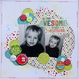
I decided to have a go at the June challenge at Deer and Fawn, it's a sketch, and I love a sketch when I am feeling in a rut, and this sketch is awesome:
I had a lot of fun with this one. I actually did it twice, but one of them was accepted by Scrapbooking Memories magazine, so can't share that one. 
I loved the simplicity of this sketch, it allows a lot of scope, and perfect for boy layouts.
In this version, I chose a photo of my nephew Lachlan, with a repeat in the smaller size. I used a stencil and paint to create the red spots in the background, then used some paint to spatter colour around the page. Loved doing this in the primary colours - having the black and white photos meant I could use any colour range.  
I used a plate to trace around to get the large circle. I then used some Stampin up punches to punch my circles. I sewed around the border with my machine - using some straight stitch and zigzag together - pretty cool effect I think, and I then doodled this onto my punched circles. 
I kept the circular theme going with my embellishments - some old brads, that I removed the posts from on the back - and mounted on foam, buttons, D-lish Scraps flair, and a sticker which I glued to a bottle cap - remember those? I also have some  Charms Creations embellishments - one of which is a DIY circle - which I added resist paint to and then coloured with glimmermist - it didn't work as well as I wanted, but it's kind of cute. Anyway, I am pleased with the end result. 
Thanks for looking at my layout, and for any comments you may leave. 
All that awesome

Tic Tac Toe Challenge at Charms Creations

The mid month challenge is up at Charms Creations, and this time it is a Tic Tac Toe challenge:
Charm has some awesome naughts and crosses that are perfect for this challenge, and can be found in the shop here. I used some of these on one of my other layouts this month, and couldn't wait to get some more of them. 
I chose the line button, something new and twine for my layout of niece Natalie and her baby Levi. My new items are the new Charms Creations embellishments, in the teal colour - gorgeous. 
The embellishments come plain, but I sewed on a button to the naught. 
The twine in my layout is hidden behind my clusters, and I have a few buttons scattered around the page, including a flair from D-lish Scraps. I made my clusters using some older die cut felt flowers which were in the perfect colours - (drawn from Levi's toy and Nat's top)-  didn't have any paper ones in the same colours. Also added some crochet flowers. The circles in the background represent the circles in the toy. 
If you think you might like to have a go at this challenge, it is open till mid July, so still plenty of time. 
Mother Love


Monday, June 22, 2015

D-lish Scraps June Inspiration Board challenge

Well this is a change, for the last 6 months I have been on the inspiration team, creating layouts for the monthly challenges - this is no longer happening, so now I get to create for the challenge again - :) . This month, the inspiration board is just as inspiring as always.
I don't often create layouts using yellow, but don't you just love all the pops of yellow in this? I do. 
I had 2 photos in mind, but one of them didn't print so well, so I used a quote tag in place of the photo. I loved the sketch, and I stayed as true as possible to it, as well as adding my own little bits of interest. I was inspired by the flowers in yellow and the word smile, hence the title. 
I die cut the film strip with an Ellison design die and ran 2 layers of washi tape around the border, one of them a film strip design. I used a Kaisercraft collectables pack for some of the elements. The D-lish Scraps products I have used are the pale yellow flowers, the resin butterfly, Freckled Fawn wood veneer, flair button and the card fetti words that I mounted onto some chipboard. 
I am so pleased with this layout of my daughter and myself with our selfie on a swing. 
Thanks for looking and for any comments you may leave. 
Smile


Sunday, June 21, 2015

123 June challenge

This month at 123 challenge blog, the challenge is to be inspired by the following:
This is a nice way to be inspired don't you think? I had a photo of my extended family that they took just prior to Christmas last year (I live away from my family), so it was nice to have this. I have been wanting to scrap it since I received it, so this challenge was just right. 
I created some texture with a stencil and texture paste on a patterned background, then sprayed this with a gold mist. I found some stamps that I overlaid each other with along the sides of the paper. I then used a large foam flower stamp, to which I added some gold embossing powder to give this cool "grungy" look flower. I added some gold washi tape around the border, and stitched around my border. I die cut some feathers in gold cardstock and patterned paper, and stitched down the centre of the gold feathers. I then embossed the word family with the same gold embossing powder. I added a Charms Creations heavenly heart as well. 
I love the way this layout turned out, and I sure hope my family do too. 
Thanks for looking at my layout and any comments you may leave. 
My Family


Off the Rails June challenge - guest designer

For the June challenge at Off the Rails Scrapbooking, Charms Creations design team (me included - lol)  were asked to create layouts for the June challenge, using this moodboard for inspiration:
I can honestly say I was  challenged by this moodboard, but that is what challenges are for, right?  I don't tend to do primary colors so well, and it was the colours that were my stumbling block.  But anyway, I managed to create a layout, and in the end, it worked. I was inspired by the words family and love, by the texture on the facade of the building and by the little wood veneer people. I chose this photo of my family. 
I started  with a wood grain patterned paper, which I scraped some paint over and added some script with texture paste and stencil. I stamped the word love onto the background. Behind my layout, I have used a chipboard piece that is brickwork, but I flipped it and added the cut out bits as added texture to the background. I also added some wood veneer people near my journaling and the title has the word family. I added one of Charms heavenly hearts. I am quite happy with the end result, even though it was a challenge.  
Thanks for looking and for any comments you may leave. 
Family Time


Saturday, June 20, 2015

Scrap the Girls June challenge

I haven't done a Scrap the Girls challenge for a while, so thought I might try it out this month. The June challenge is to be inspired by the following mood board:
I felt overwhelmed by the boldness of the board initially, but took a step back, and rethought the process. I ended up using small amounts of the colours on my layout, rather than too much boldness. The colours are gorgeous together, and I am happy with the overall softer approach to this layout. My inspiration came from the colours and the word love. 
I used a photo of niece Chloe, who was showing off her reading skills at a recent family catch up. Chloe has just turned 6. 
I used a really funky Dylusions alpha stencil, to feed into the theme of reading. I sprayed over this with Heidi Swapp mists and Prima colour bloom. I found some words from a really old tin of K & Co words to go - remember those? I managed to find some that represented words, stories and childhood., so have placed these randomly as a layer behind the photo. A few layers of patterned papers over this and then the embellishments. I added a Charms Creations spotty mini heavenly heart, plus crochet flowers and a hand dyed Green Tara tutu flower. 
Thanks for looking at my layout, and any comments you may leave. 
Precious


Wednesday, June 17, 2015

Scrapping Outback June "White with a twist" Challenge

The June "White with a twist" challenge at Scrapping Outback is to use the following image as inspiration:
It's a pretty awesome image, makes me want a mint thick shake with chocolate, yum.
Anyway, I chose a photo taken in Singapore last year, as it had a lot of greenery in it. I don't usually like working with green, but this one captured my imagination, and I had a lot of fun playing. I guess the overall design is ok, I don't think it is what I first envisaged. 
I started with a Kaisercraft patterned paper to which I sprayed with Lindy's stamp gang, then stencilled using a Scrap FX stencil and texture paste, to create a tropical leafy feel. I rubbed some metallic lustre over this. My chipboard pieces are from Buzz and Bloom and I added Tim Holtz distress embossing powder to this. Under the photo is a range of scrap papers and some torn cardboard. I then added the whole layout to a piece of chipboard to frame it. 
Thanks for looking at my layout and for any comments you may leave.
Chillaxin


White With 1 June challenge

The June challenge at White with 1 is to use the following colour:
[biscay%2520bay%255B4%255D.jpg]
I had a couple of photos in mind for this layout, but went with this one of nephew Jareth. The Biscay Blue was a perfect colour match I feel. 
I created the background with texture paste and a Kaszazz stencil. I then sprayed with Lindy's stamp gang spray, and stamped using a Prima stamp and Heidi Swapp stamp. I added some patterned papers and some torn up tissue paper as a layer under the photo. I added a chipboard piece from Imaginarium designs. I also added a bit of machine stitching. Embellishments include a heart embellishment from Charms Creations, a journalling tag from D-lish Scraps, buttons and Freckled Fawn wood veneer arrow. 
I love how this one turned out.
Thanks for looking at my layout and for any comments you may leave. 
Mister Serious


Saturday, June 13, 2015

Scrap the Boys June challenge

For the June challenge at Scrap the Boys, there is an awesome sketch to use:
I really loved working with this sketch, so very, very cool for a male layout, I can see myself doing another one. I chose these 3 mini prints of my husband and my son, which I took last Fathers Day, of them just sitting and being together enjoying each others company. 
My layout background was created on Teresa Collins paper, to which I had tried doing some stencilling on for another layout, but made a mess of that, set it aside, but was able to pull it out and use it for this challenge -waste not, want not, especially Teresa Collins paper. 
I then added more to the background with a TCW stencil and Tim Holtz inks and then splatters of dylusions ink. I added a heap of cotton thread and then built my layers with some old scrap Basic Grey and Kaisercraft captured memories cards. The words are cut out from Teresa Collins co-ordinating paper. The embellishing otherwise is kept pretty simple, only the naughts and crosses/plusses embellishments from Charms Creations, and a flair button. 
I love the overall effect of this layout, so do my boys. 
Thanks for looking and for any comments you may leave. 
Cheers


Friday, June 5, 2015

Kraft+ June Challenge - In the Jungle

Wow, Sandra at Kraft + has created yet another fantastic challenge or June, the inspiration board is titled "in the jungle", and the challenge is to use animal print and circles:
This one is a whole load of fun, and I knew exactly which photo to scrap - one of the white tigers at the Singapore Zoo from our visit there last year. Tigers are my favourite animal, and these white tigers were beautiful. They looked pretty hot on this particular day though - it was muggy!
I had the perfect Charms Creations embellishments to use for the challenge, which are currently in store and are perfect to use. I used the arrows that are available in a set of various embellishments, or on their own. 
I decided to take the jungle theme to the full extent, as the tiger enclosure was very jungle like, hence all the greenery on my layout with the leaves and the jungle vines. I had the flair buttons from Funky Flairs Studio which were also perfect for this layout, and I turned the zebra stripe on it's side to replicate the tigers vertical stripe. I found these fantastic thickers in the tiger stripe, and to tie it all together, I coloured the word tiger in with an orange Wink of Stella pen, as they were originally white. 
I love how this one turned out.
Charm is sponsoring this months challenge, so if you would like to have a chance at winning a voucher, give this one a go. 
Thanks for looking at my layout and any comments you may leave.
White Tigers


Wednesday, June 3, 2015

Show Us Your Stuff June Challenge

Wow, can you believe it is June already? I wish time would slow a little.
This month at Show Us Your Stuff, we are featuring a moodboard, designed by Paula:
Isn't this pretty? 
For the layout I created, I was inspired by the phrase, Baby its cold outside. I was initially thinking I would scrap a wintery style photo, but none that I had worked with the colours in this moodboard, and I was quite struck with the blues and orange. So I really concentrated on the word Baby. I used this photo of our nephew Levi, who was a new baby at Christmas, he was snuggled in a blanket, as it was a really cold night here in Melbourne on Christmas night, so that helped me link the word baby and cold together. 
For my layout, I also allowed the music in the moodboard to help with my paper choices, which are Maggie Holmes paper and Kaisercraft paper. I allowd the blue and orange colours to guide my embellishment choices. 
My handmade embellishments are the lollipop and heart from Charms Creations, the button flair from D-lish Scraps, and a hat pin that I made myself. 
I hope you have a chance to have a play with this moodboard.
Snug as a Bug